Introduction
This posting consolidates my notes regarding creating two or more chart areas within single chart object or web part. Chart areas are separate graphs that involve completely separate data sets but that are still displayed within the same chart web part. Using a single chart web part to display multiple graphs enables you to conserve page area and also present related graphs in a more intuitive manner. This posting walks through creating a single chart web part that displays two graphs, a line graph and a scatter graph, as show below.

Notation
After adding the Chart web part, and then clicking on Advanced Properties, this is what you see initially:
Note the locations of Select and Element, at left, and the Details pane in the middle. Note also that, in the details pane, configuration items are grouped by a bolded header, such as Appearance in the above image. The Select and Element and Details pane are the configuration tools that you will be using extensively from here on out.
For this posting, a configuration step will be shown using this notation:
- Select an Element > Chart: [subelement] > [Details group header] > [subgroup header] > [configuration item]: Value
As an example,
- Select an Element > Chart: Chart Areas > Grid&TickMarks > MajorGrid > Interval: 10
If it can already be understood that items in the Details pane are to be configured, then the entire path won't be written down but abbreviated and indented like so:
- [Details group header] > [subgroup header] > [configuration item]: Value
As an example,
- Grid&TickMarks > MajorGrid > Interval: 10
For some elements, there is an additional configuration item situated atop the Details pane. For example, if you select the Chart Areas element, you initially see this:

Note the Axis Menu drop down. The existence of this additional configuration item and its type are strictly dependent on the element that you select in the Select an Element, at left. For those cases where you need to select from this configuration item, the following notation will be used:
- Select an Element > Chart: [subelement] > [Configuration item]: [Configuration item selection]
Procedure
1) Create a list and populate it with two data sets, F1(x) and F2(x). F1 will be data generated from a simple line function: F1(x) = ax, where a = 0.2 and x = {-10 to 10}. F2 contains random data, where x = {-10 to 10} and y = {-10 to 10}. For this posting, the list has four columns: X, Y and X2, Y2.
2) Add a single Chart web part to a page.


If you are not able to find the chart web part, perhaps because you have not enabled the Publishing feature, you can still easily make this web part available without having to activate the Publishing feature. See reference [1] for details.
2) Choose the list as the data source, and then bind the chart to the appropriate columns in that list like so:

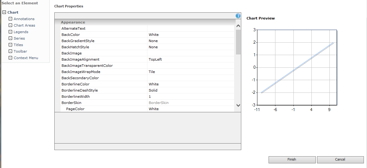
3) Clicking Finish then returns this:

What you see here is a chart object displaying a single chart area. Now let's configure this chart area to make it look like the chart displayed at the beginning of this posting.
4) Click on Advanced Properties. and then make the following configuration changes to this
- Select an Element > Chart: Chart Areas > Axis Menu: X-axis
- Grid&TickMarks > MajorGrid > Interval: 10
- Grid&TickMarks > MajorGrid > LineColor: Black
- Grid&TickMarks > MajorTickMark > TickMarkStyle: AcrossAxis
- Grid&TickMarks > MajorTickMark > Size: 3
- Grid&TickMarks > MajorTickMark > Interval: 5
- Grid&TickMarks > MajorTickMark > Enabled: True
- Grid&TickMarks > MinorGrid > Interval: 1
- Grid&TickMarks > MinorGrid > LineColor: Gainsboro
- Grid&TickMarks > MinorGrid > Enabled: True
- Grid&TickMarks > MinorTickMark > TickMarkStyle: AcrossAxis
- Grid&TickMarks > MinorTickMark > Size: 1
- Grid&TickMarks > MinorTickMark > Interval: 1
- Grid&TickMarks > MinorTickMark > Enabled: True
- Labels > LabelStyle > Interval: 1
- Scale > Crossing: 0
- Scale > IsMarginVisible: False
- Scale > Maximum: 10
- Scale > Minimum: -10
- Select an Element > Chart: Chart Areas > Axis Menu: Y-axis
- Repeat above
After making these configuration changes, you will have this:
Now let's configure a second chart area and display it in the same chart object
5) Click on Advanced Properties. Look up above the Details pane and look for the Axis Menu. Now look to the right of this: do you see the little plus "+" symbol? Click on this. After you do this, the page will refresh. After this finishes, if you look in the Axis Menu, you will no longer see Default menu option showing but ChartArea1. Note also how the first chart area has compressed vertically: it's height is now half of what it was before. This is because another chart area object has been created and the first chart area object size properties have been modified to give room for the second chart area object. Click Finish.
6) Click Data and Appearance, and then click Connect Data to your Chart. Look for the Series Properties item and then expand it. You'll see something like this:

Now open the Series dropdown: you can't because only one series exists so far. I've named the first data series F1. You can change it to whatever you like by simply editing what you see in the Series Name text box. Edit the text there and then click somewhere else: the change Note also the Series Chart Area configuration item. This is the critical one for you. This is how you associated different data series with different chart areas, effectively assigning different data to different charts. Anyway, another data series needs to be added.
Click the plus sign "+" next to the Series dropdown. Series 2 now appears in this dropdown. I'm going to change its name to F2 by editing its name in the Series Name text box.
7) Configure new data series. Now that I have this second data series, it remains to configure it. I want this to be a scatter or point plot, so, from the Series Type dropdown, select Point. Next, I want to associate it with the second chart area object, so, from the Series Chart Area dropdown, select ChartArea1. Lastly, I need to assign the appropriate list columns to the X and Y axis values. To do this, select Y2 from the Y Field dropdown and X2 from the X Field dropdown. At this point, the configurations will look like so:

Click Finish. You will then see the following:

The Chart object is now configured with two chart area objects, each displaying a different graph using different data sources. Now let's configure the second chart area object.
8) Click Advanced Properties, and then make the following configuration changes like so:
- Select an Element > Chart: Chart Areas > Axis Menu: ChartArea1: X axis
- Grid&TickMarks > MajorGrid > Interval: 10
- Grid&TickMarks > MajorGrid > LineColor: Black
- Grid&TickMarks > MajorTickMark > TickMarkStyle: AcrossAxis
- Grid&TickMarks > MajorTickMark > Size: 3
- Grid&TickMarks > MajorTickMark > Interval: 5
- Grid&TickMarks > MajorTickMark > Enabled: True
- Grid&TickMarks > MinorGrid > Interval: 1
- Grid&TickMarks > MinorGrid > LineColor: Gainsboro
- Grid&TickMarks > MinorGrid > Enabled: True
- Grid&TickMarks > MinorTickMark > TickMarkStyle: AcrossAxis
- Grid&TickMarks > MinorTickMark > Size: 1
- Grid&TickMarks > MinorTickMark > Interval: 1
- Grid&TickMarks > MinorTickMark > Enabled: True
- Labels > LabelStyle > Interval: 5
- Scale > Crossing: 0
- Scale > IsMarginVisible: False
- Scale > Maximum: 10
- Scale > Minimum: -10
- Select an Element > Chart: Chart Areas > Axis Menu: ChartArea1: X axis
- Repeat above.
At the end of all this configuration, click Finish. You'll now see the following:

The next to last step is to make this align horizontally rather than vertically.
9) Click Advanced Properties, and then configure as follows:
- Select an Element > Chart: Chart Areas > Axis Menu: Default (this is the first chart area)
- Alignment > AlignmentOrientation: Horizontal (you need to doubleclick on this menu option in order to set them - different from other menu options)
- Alignment > AlignmentStyle: Position (you need to doubleclick on this menu option in order to set them - different from other menu options)
- Appearance > Position > X: 0
- Appearance > Position > Y: 0
- Appearance > Position > Width: 50
- Appearance > Position > Height: 100
- Select an Element > Chart: Chart Areas > Axis Menu: ChartArea1
- Alignment > AlignmentOrientation: Horizontal (you need to doubleclick on this menu option in order to set them - different from other menu options)
- Alignment > AlignmentStyle: All (you need to doubleclick on this menu option in order to set them - different from other menu options)
- Appearance > Position > X: 50
- Appearance > Position > Y: 50
- Appearance > Position > Width: 50
- Appearance > Position > Height: 100
At this point, before clicking Finish, you will see this:

Notice how the two chart areas still occupy the same space as previously. In fact, they now occupy the same space that the original chart area occupied previously, before the second one is configured. Keep in mind that the chart area object is separate from the chart object. Thus far, most of our configuration has been on the chart area objects. We haven't made any changes to the chart object size properties. So, the chart object continues to be presented at the same width and height as originally configured by default, or 300px x 300px. If packing two chart areas into the default width chart object reduced the graph widths by half, doubling the chart object width should restore the chart area widths to what we want to see. Click Finish.
10) Click Advanced Properties, and then configure as follows:
- Select an Element > Chart (do not select a subelement)
- Layout > Width: 600
Click Finish. You'll now see the same chart that you saw at the beginning of this posting:

References
- Primary
- SharePoint 2013: Chart Web Part Missing
- Chart Class
- ChartArea Class
- ChartArea.AlignmentStyle Property
- ChartArea.Position Property
- Additional
Notes
- I have not been able to find any Microsoft documentation that adequately covers all of the many configuration items of the SharePoint Chart web part. Instead, I have used the MSDN documentation on the .NET System.Windows.Forms.DataVisualization.Charting Namespace, which though sparsely descriptive, does provide helpful insight into what properties and methods do.
No comments:
Post a Comment